Additionally, having a podcast cover is a criterion for getting your podcast featured on Apple podcasts or any major listening app.
They say pictures are worth a thousand words. Your podcast artwork could convey more about your show than your podcast description. As a result, you must give considerable thought to your podcast cover design.
Even tho you can delegate your podcast cover art design to a professional, but this article is here to provide all the guidance you need to create a fantastic cover image by yourself that suits your show.
Factors to Consider Before Designing your Podcast Artwork
You might be pretty pumped to release your new podcast, but please hit the breaks before rushing into your cover art design if you aren’t educated on this concept yet.
Firstly, you have to ask yourself some vital questions:
Who is my podcast for?
The target audience is considered in every stage of podcast development and your cover art design isn’t any different. Have an inside look into the kind of aesthetics that resonates with your potential listeners.
Note that the aim of your cover art is to attract your audience. Understanding what your intended audience gravitates to is essential if you must achieve this objective, here are a few questions you can ask yourself to know more about your listeners:
- What’s the age, gender, and ideology of your ideal listener?
- what class of people do you imagine to be interested in your show?
- Are they experts or just vaguely familiar with the topic?
How do I represent my podcast graphically?
A podcast cover artistically represents your show with an image. People should tell what your podcast is about at first glance. Keep it simple. You don’t have to go over the top, subtle symbolisms should suffice, if you find yourself stuck with ideas, ask yourself few questions to get your creativity going:
- What’s the name of your show?
- What is your podcast about?
- Which category or niche does your podcast belong to?
- What topics are you going to be tackling?
- What is the tone of your show?
Restrictions and Specifications for Podcast Cover Art

The podcast directories have specific criteria to make all shows equal, good thing all directories have similar format requirements.
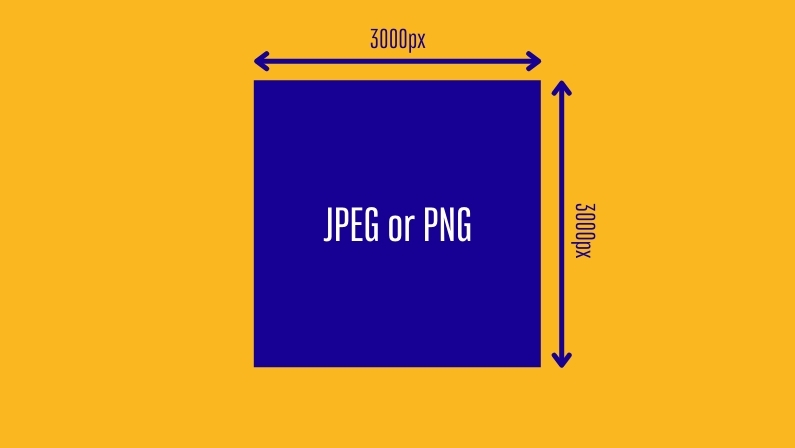
Podcast artworks typically have a minimum size of 1400 x 1400 pixels and a maximum of 3000 x 3000 pixels, which comes in as a square dimension, and the format is either JPEG or PNG format(.jpg or.png). Sizing your cover art around 3000 x 3000 puts you on the safe side, evading the stress of possibly resizing later.
Some hosting services may advise you to compress your image files to provide a better experience for mobile devices. This helps pages load faster and more presentable.
Here’s a summary of all specifications you need to put in mind:
- Recommended Size: 3000 x 3000 pixels (square)
- Format: JPEG or PNG
- Pixel density: 72 dpi
- RGB color space
- Compressed image if possible
Getting Started with Your Podcast Cover Art

One of the things to carefully consider at the creation stage of your cover art is how well the design describes your podcast. and here are some questions you should ask yourself:
- What exactly should the image represent?
- Is the show host-centered?
- Would typography do it?
- Do you need a design illustration to communicate your message clearly?
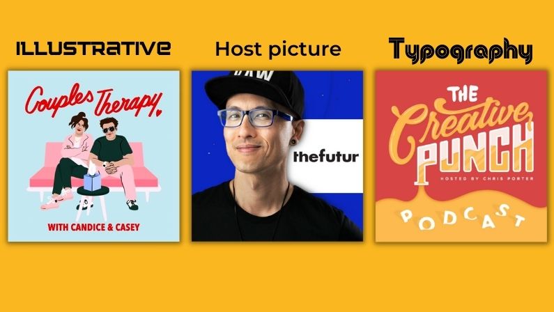
Fundamentally, the subject of a podcast determines what podcast cover arts should depict and there are 3 formats you can follow:
Illustrative:
Illustrations are symbols that are commonly labeled with a particular subject portray the content of a podcast without the user having to read a single word of its podcast description. Seeing an illustration naturally communicates the essence of concrete ideas to the audience.
Host picture:
If the podcast revolves around the host’s persona, nothing is more befitting than their face. The host’s demeanor also passes a message across to the viewer.
Typographic:
If the show is about an IDEA, base the podcast cover photo on the prominent topics discussed on the show. In some cases, graceful typography suffices for a cover art design.
If this still doesn’t stimulate you, look at some of your best show’s cover art to draw some inspiration. Study how the design fits the context of the podcast seamlessly and you can find great ideas here
Be authentic with your cover art design, you’d be doing a huge disservice to your podcast if you decide to lazily imitate a cover from another show. Remember what we said about cover arts and first impressions. copying from another design sends a bad message about your podcast, ruining the chances of getting new listeners from the get go.
Make it stand out everywhere it appears:
As previously stated, your artwork functions as a podcast thumbnail on its dedicated podcast directory. However, you may use them for other purposes, like as an avatar on your social media account and business cards.
Here are things to keep in mind while designing a podcast cover:
- Simplicity is key in Cover art design, squeezing too much into the drawing tends to make them look messy, too little and it will be considered boring.
- Flexibility: Think about flexibility while designing a cover design, considering that it might be branded on your merch, business card, or social networks. If a one-for-all solution doesn’t work, Make one for each case to fit better with the intended use.
- One message: It needs to have one main message, too many messages and it will be confusing.
- Identifiable: your ideal listener should spot it right away and be drawn to it, you might use the power of colors to set yourself apart.
- Branded: the cover must have a consistent theme that viewers can easily identify with your brand.
Furthermore, your audience should be able to identify it as a podcast at first sight. As obvious as that sounds, many miss this point.
Think of a user scrolling through social media and sees your post, are they able to tell that it is from a podcast at first glance?
here are some ideas to help you with that:
- Some choose to identify with a name that includes “podcast” which could do the trick.
- Others chose to attach a podcast icon like a microphone to the cover art to provide clarity, which can be good if used creatively but you generally want to stay away from that except if your show actually talks about podcasting.
Styling Your Cover Art
The six elements involved with the graphic design of cover arts are:
- Shape
- Typography
- Colors
- Lines
- Framing
How you incorporate all these properties into your design defines its style. Navigate these elements carefully as you style your cover art.
The lines and shapes are prominent features that illustrate the subject of your artwork. Use lines to take the eye of your viewers to places you’d like to highlight.
The size of the podcast cover image determines its texture and framing. Too many textures and forms might make the design messy and can scare away listeners, so you want to go for a clean minimalistic design that’s easily understandable.
Use the colors at your advantage and choose according to the subject of your show, for example grey schemes are terrific for podcasts with historical content, while inspiration podcasts should take on brighter looks.
Find what works for you and create the cover art that really represents your show.
How to create one:
You can use any design tool to create a podcast cover art, for beginners we recommend using Canva, but any other tool will be a great choice especially if it has templates you can start with.


0 Comments